Install the app
How to install the app on iOS
Follow along with the video below to see how to install our site as a web app on your home screen.
Note: This feature may not be available in some browsers.
You are using an out of date browser. It may not display this or other websites correctly.
You should upgrade or use an alternative browser.
You should upgrade or use an alternative browser.
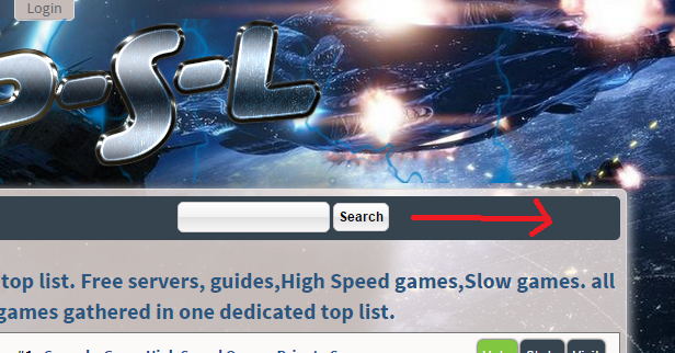
searchbox and layout on smaller screens of sync
- Thread starter top250
- Start date


It happens because you removed fixed header width and used such a big logo.
The result is, a 100% width logo area, leaving the ad zone html, which gets push down a line and floated right = next to the search box.
Easiest solution, since you not have room up there for the ad anyway, remove the html
Second option, to just hide it, add to user.css
The result is, a 100% width logo area, leaving the ad zone html, which gets push down a line and floated right = next to the search box.
Easiest solution, since you not have room up there for the ad anyway, remove the html
Code:
    <div id="headside">
        <div id="headbanner">{$zone_a}</div>
    </div>
Second option, to just hide it, add to user.css
Code:
#headside {
  display: none;
}

It happens because that theme is really bad for a responsive view. For once zoom in is not so nice. I suggest you read up on responsive a bit.
It aint fixable unless you properly code for screen sizes. Giving really big images max-width: 100%; for example
dont use fixed element widths, instead use % based. Or if fixed pixel values, you have to work with css media queries to catch specific screen sizes
Dont see another way to fix that issue beside proper responsive
")